The lifecycle of a developer’s personal website is a reflection of the ever-evolving landscape of web technologies. Mine is no exception, having gone from humble HTML and CSS beginnings through Create React App and eventually landing on Gatsby. However, Gatsby has shown its age and I found myself seeking a modern alternative. Enter Astro — a framework that has breathed some new life into this site.
Catalysts for change
My decision to redesign wasn’t just about using a new framework. I had specific goals in mind:
- Create a dedicated writing space: I wanted a platform fully under my control for showcasing my ideas.
- Reduce maintenance overhead: My Gatsby site had become a burden. I couldn’t build the site locally or upgrade dependencies, leaving it outdated since 2019.
- Make the design feel more professional: I wanted a cleaner, simpler look that reflected my growth as a developer and designer.
The transformation
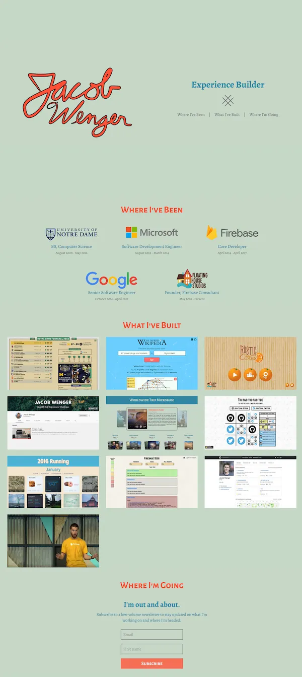
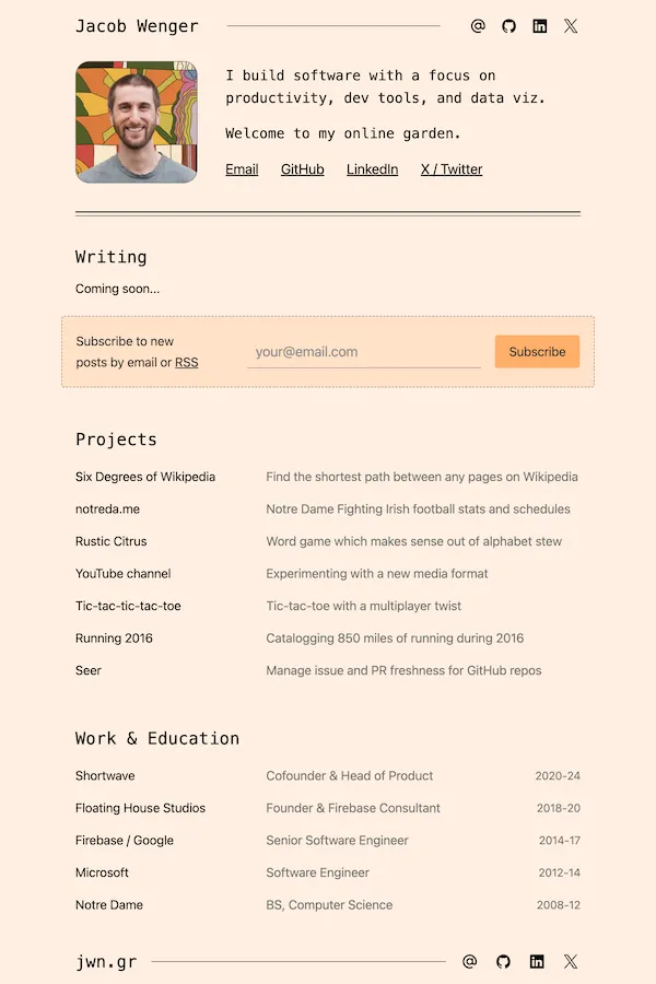
Before diving into the technical details, let’s look at the visual transformation:
Old site design
New site design


Key changes include:
- New writing section for blog posts, with an RSS feed
- Smaller hero section focused on my interests
- Updated color scheme and shift to standard browser fonts
- Simpler design with fewer images and animations
- Updated and accurate work history
Astro’s take on static site generation
Beneath the surface, the codebase underwent a complete overhaul. Stuck on an outdated Gatsby 1.x version, a full rewrite became the path of least resistance.
My experience with Gatsby’s older version was fraught with complex data fetching, sluggish builds, and challenging upgrades. While Gatsby has evolved, Astro emerged as a fresh alternative, ultimately offering a smoother developer experience and enhanced site performance.
Both Gatsby and Astro are static site generators (SSGs), meaning they generate HTML at build time which is then shipped to the browser. This is ideal for portfolio and blog sites like mine which have little dynamic content and want to optimize for search engine indexing.
Where Gatsby and Astro differ is in how they handle rendering and interactivity:
- Gatsby generates static HTML at build time, then hydrates into a Single Page Application (SPA) using React, with navigations being handled in JavaScript.
- Astro is designed as a Multi-Page Application (MPA) by default, shipping minimal JavaScript and delivering static HTML via full page reloads.
Astro delivers faster page loads and better SEO out-of-the-box, while offering flexibility through Islands for interactivity and optional server-side rendering. For my primarily static site, Astro’s approach is a perfect fit, eliminating the unnecessary overhead of a full SPA or React-powered solution.
Where Astro shines
Astro does a lot right. Here’s what stood out to me during the migration:
- Component-based design: Astro’s component architecture brings one of React’s largest benefits without the dependency. It has some limitations covered below, but the abstraction feels very familiar.
- Simplified data handling: Astro’s approach to data fetching feels like a return to basics.
No more GraphQL queries everywhere — just straightforward data access using
importandawait. Content collections provide a clean, type-safe API for my blog with minimal code. - TypeScript support: Astro’s extensive TypeScript support provides peace of mind and speeds up development.
- Simple, well-designed integrations: Astro’s integrations required less code and configuration than I remember from Gatsby. I easily added an RSS feed, sitemap, and MDX support for the blog.
- Framework flexibility: The ability to fall back to React (or other frameworks) when needed feels like the right trade-off, avoiding lock-in to Astro’s ecosystem. I leveraged this for my newsletter signup form, which I didn’t have time to migrate from React.
- Thoughtful documentation: The docs are extensive, well-organized, and even include a guide on migrating from Gatsby.
Challenges with Astro
The migration was not without hurdles:
- Conditional CSS: Astro’s approach required rethinking my styling strategy, making some
tasks more tedious compared to using
styled-components. Conditionally applying styles using classes and CSS, even with the help ofclass:list, required more code than I would like. - Component conversion: Moving from untyped React class components to
.astrocomponents with TypeScript was time-consuming but ultimately beneficial. I still have some hesitation with the proprietary file format, but it looks and behaves like TypeScript, JSX, and CSS. - Lack of multiple exports from
.astrofiles: This limitation led to some code organization challenges.FlexRowandFlexColumnshare a commonFlexcomponent that ideally would never be exported. Named exports are important for maintaining large codebases, and I would love to see support for this added to the format.
The results
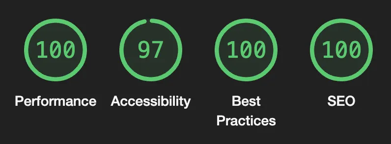
While metrics weren’t a primary goal with the redesign, I’m quite happy with the final outcome. Page loads come in at just a few 100 kB, load within a few 100 ms, and have nearly perfect Lighthouse scores across the board:

More importantly, I achieved my initial goals:
- Dedicated writing space: Creating a blog post is now as simple as adding a
.mdxfile, and I’m able to fall back to React as needed for more interactive posts. - Reduced maintenance: Fewer dependencies, less code, and more confidence in future upgrades.
- Refreshed appearance: The new design better represents my current skills and aesthetic preferences.
Looking forward
My website has gone from a source of frustration to a canvas ready for sharing my work. It is simultaneously simpler and more capable, which is always what I’m going for.
The best framework is the one that meets your current needs and brings joy to your development process. Astro is doing that for me right now.